
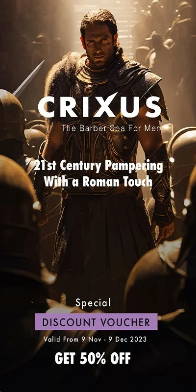
CRIXUS
Brand design for male barber shop
21st Century Pampering With a Roman Touch
Branding
Logo Design
Assets Design
Ray’s Barber Shop wanted to create a strong logo and brand to communicate their many years of experience and the quality services they provide. They will use their site and social media to showcase their work, and will sell premium hair products and vouchers online. They want to build a community of loyal customers and provide a welcoming space for male pampering.
(This was a unsolicited project as part of a Masters in Creative Digital Media & UX).
Challenge
An online and offline analysis of Dublin barbers in October 2023 shows a spectrum of styles and approaches from low-end local shops to high-end chains across three main categories: Firstly, traditional, often offline barber shops follow a classic aesthetic of red-blue-white design linked to the profession’s origins in surgery and dentistry (i.e. Beards & Barnets). Secondly, many designers choose clean, minimalistic layouts with a prevalence of monochromatic tones and vintage inspired elements to showcase the skillful craftsmanship of barbers and a welcoming ambience (i.e. AJ’s Barbershop and Sam’s Barbers). Thirdly, there is a growing trend of high-end, premium brands represented through luxury design assets. Positioned as barber spas, they combine the first two categories, with typography choices ranging from bold and retro to modern and sleek (i.e. Men's Grooming Ireland).
Due to Razor Ray’s focus on premium products and male pampering, I propose a rebrand in line with the third category to achieve his mission and establish a loyal customer base with franchise opportunities, which also gives room to his previously unreflected Italian heritage:
Solution

Brand concept
“Barber shops” originated in Roman times as sanctuaries: Places of luxury, providing socialisation and male pampering, often frequented by gladiators - highly skillful fighters adored by the public. Crixus, a Gallic gladiator and military leader who started a rebellion, serves as the foundation for Crixus Barber Spa, setting the brand apart through a unique fusion of tradition and modernity.

Name

Crixus directly refers to the rebel gladiator to represent strength, courage and unionship. It denotes the community spirit of the brand, depicting the socialisation that the barber spa provides to its customers.
Logo
The brand leverages the iconic imagery of a gladiator, symbolising strength and unionship, to create a distinctive visual identity as a homage to the ancient Romans as the originators of barber shops, male grooming and aesthetics.
Font/typography
The choice of ‘Futura Bold’ injects a modern and sleek feel, aligning with contemporary design trends while ensuring readability and memorability. A spacing of 100 assigned to the letters adds a sophistication and composure to Crixus’ services. The ‘X’ is subtly sculpted into a blade to emphasise the gladiator theme, and to reflect the precision and cutting edge technology applied by the skilled craftsmen. The minimalist typeface is carefully selected to juxtapose the strong emblem of the gladiator. The tagline, ‘The Barber Spa for Men’, applies a Helvetica font to stylistically complement ‘Futura Bold’.
Colours
In comparison to existing barber shop brands in Dublin, Crixus introduces a unique colour palette that combines classic barbershop tones with contemporary vibrancy, reflecting the dynamic spirit of the rebel gladiator. The use of purple - closely associated with Roman royalty, power and wealth - symbolises the luxurious experience Crixus’ customers receive. The black font continues the theme of elegance and sophistication, but can also be used in the aforementioned purple when required, while white complements both as an equally important colour of the Romans (extensively used in clothing as well as important landmarks).

Design Iterations
By embracing Crixus's rebellious spirit, the brand stands out as a beacon of innovation in the Dublin barber scene. The brand concept resonated well with users when tested, albeit the visual elements such as the gladiator emblem, colour scheme, logo and fonts, required an iterative process, reflected in the appendices below.
The combination of traditional values with modern design elements not only pays homage to the gladiator's legacy but also positions Crixus as a forward-thinking and community-focused establishment.